Crafting a Digital Gateway: The Design Story of Mokuba Sushi
February 1, 2024

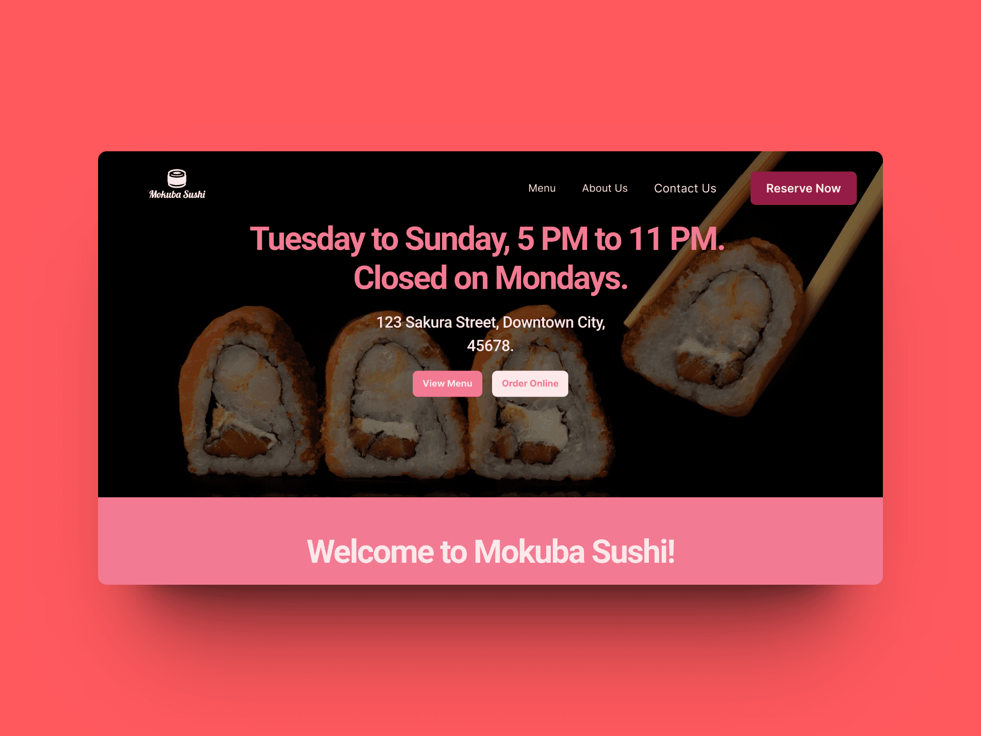
As a web designer with a passion for the culinary arts, I've always believed that a restaurant's website should be a digital gateway to its soul. This belief led me to create Mokuba Sushi, a mock-up restaurant that embodies my design philosophy. Here’s an insight into the creative process and decision-making that went into constructing the Mokuba Sushi one-page website.
Warmth and Identity Through Color
When selecting the color palette for Mokuba Sushi, I turned to the UI-colors app generation. The resulting scheme exudes warmth and invites the user into a space that’s both welcoming and expressive of a strong brand identity. I chose colors that suggest a cozy ambiance, hoping to digitally replicate the intimate experience of dining at a premium sushi restaurant.
Menu at the Forefront
In a departure from my initial design for the first Mokuba Sushi mock-up, I’ve now positioned the menu at the top of the page. This reflects a new design resolution that aligns with my one-page website philosophy: direct and effortless access to the most crucial information. This isn’t just a design choice; it’s a statement of understanding and respect for the customer’s time and needs.
Simplicity as the Ultimate Sophistication
I've designed the website to be straightforward because I believe simplicity is the ultimate sophistication. The quicker customers can navigate the menu and understand their options, the more they will appreciate the experience. Other establishments may ask for several interactions before divulging essential details, but at Mokuba Sushi, the first interaction is the most informative.
Empathy in Design
I always remind myself to step into the shoes of the user. A restaurant visit can be a significant event — perhaps even the highlight of someone’s year. I keep this in mind as I design, ensuring the ease of accessing the menu and prices is paramount. It’s about making that big night out feel special from the very first click, removing barriers that could dampen the anticipation of a luxury experience.
Conclusion
In creating the Mokuba Sushi website, my goal was to craft an experience that feels personal, intuitive, and considerate of the user’s journey from screen to seat. This project has been a labor of love, reflecting my belief that food — the universal language of flavor — deserves a platform that speaks with clarity and welcomes with open arms. By showcasing the menu upfront and using colors that set the mood, I’ve aimed to design a space that doesn't just showcase the restaurant's offerings but also communicates its story and ethos. I hope that this mock-up serves as inspiration and a benchmark for how simplicity and user-centric design can create a digital experience as delightful as the dining experience itself. Every design element on the Mokuba Sushi website has been handpicked to serve a purpose: to guide, to inform, and to delight.
© 2024